I decided there will be 3 'factions' in the dungeon I will run. Here's the scrapbook for stocking it.
The Good

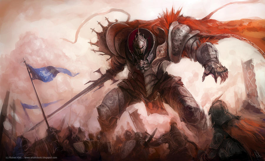

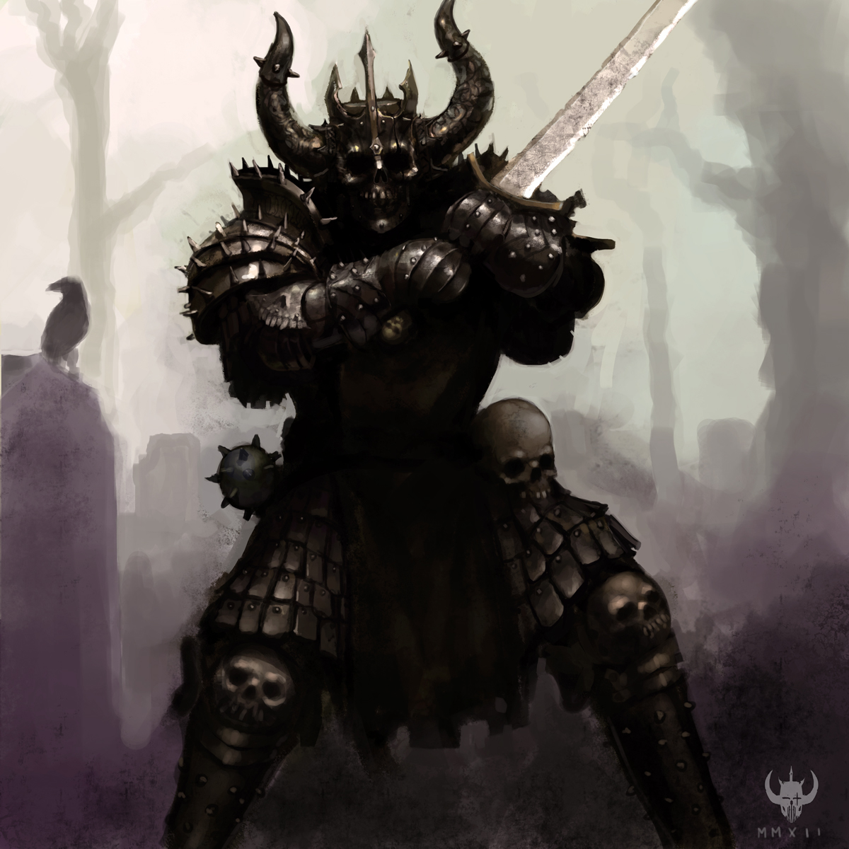
The Bad


windmaker.deviantart.com

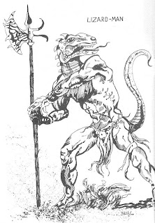
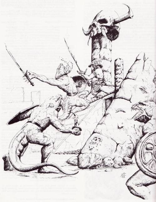
I have no idea, who drew the last image, but I love how he/she/it made the lizard men look like slavers from some empire, rather than cavemen!
The Goblin
I always really liked the art direction Magic: The Gathering took with portraying goblins, especially in earlier editions. They can be zany, scary, serious and simply stupid, but somehow there is a feeling of an overarching theme that makes them memorable.


Also, while looking for the links to the MtG images, I found a newer card called Goblin Battle Jester. I don't care about the artwork, but the idea of 'battle jesters' is here to stay.
I feel the same about magic:tg and goblins. Some really nice artwork/inspiration there. I tried to use some of that to give goblins this "zany, scary, serious and simply stupid" feel in my D&D game. Maybe this is of some use for you, too (if it's not already too late...):
ReplyDeletehttp://the-disoriented-ranger.blogspot.de/2012/12/ill-deeds-and-utter-escalation-spin-on.html
I got sick so we had to cancel. Thanks a lot for the link!
DeleteIain McCaig was the artist of the slaver lizardmen. It's an illustration from the Fighting Fantasy book Island of the Lizard King.
ReplyDeleteWOW! Thanks a lot!
Delete